A truck wrap can be one of the most visible branding assets a business owns. Whether it’s a pickup truck, cargo van, service vehicle, utility truck, or box truck, vehicle graphics often represent a company’s brand in front of thousands of people every week.
Yet many truck wraps fail to deliver the results business owners expect. The problem is rarely the vinyl material or installation quality. More often, the issue comes down to design.
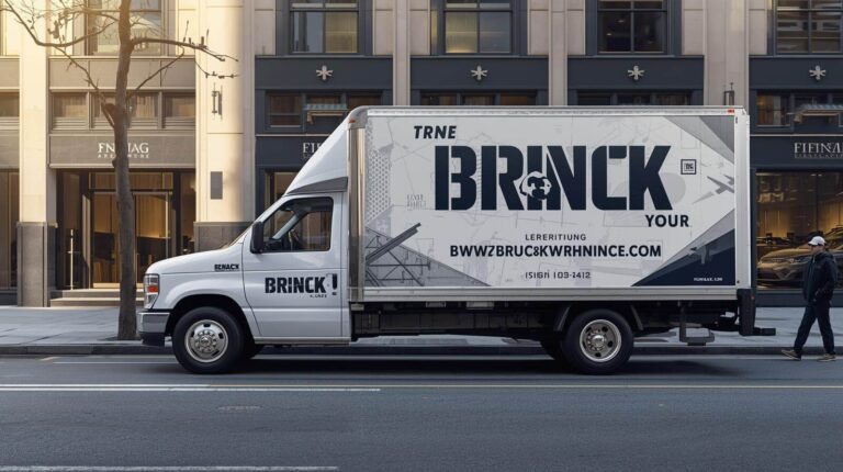
Some wraps look impressive on a computer screen but become difficult to read once the vehicle is parked on a job site or moving through traffic. Others attempt to communicate too much information, leaving potential customers confused rather than informed.
The most effective truck wraps are designed around a simple principle: communicate the right information quickly. A person may only have a few seconds to see the vehicle. During that brief moment, the wrap should clearly identify the company, explain what it does, and provide a way to make contact.
In this guide, we’ll look at some of the most common truck wrap design mistakes businesses make and how to avoid them.
The Short Answer
Most truck wrap design problems fall into four categories:
- Too much information
- Poor readability
- Weak branding
- Lack of consistency
A successful truck wrap should allow someone to answer three questions within a few seconds:
- Who is the company?
- What do they do?
- How can they be contacted?
If those answers are not immediately clear, the design may need improvement.
Mistake #1 Treating a Truck Wrap Like a Brochure
This is probably the most common mistake we see.
Many businesses try to include every possible detail about their company on the vehicle.
The wrap ends up containing:
- Every service offered
- Multiple phone numbers
- Long lists of certifications
- Marketing slogans
- Social media accounts
- Email addresses
- QR codes
- Website URLs
The result is often visual overload.
A truck wrap is not a brochure, website, or sales presentation. Most people see commercial vehicles while driving, walking, or passing through traffic. They do not have time to read paragraphs of information.
In many cases, reducing information actually improves performance.
The most effective wraps focus on the essentials and eliminate unnecessary distractions.
Mistake #2 Making the Logo Too Small
Many businesses spend considerable time developing their logo but then make it one of the smallest elements on the vehicle.
Brand recognition plays a major role in vehicle advertising.
A truck wrap may generate hundreds or even thousands of impressions each week. Over time, repeated exposure helps people become familiar with the business.
If the logo is difficult to see, much of that branding value is lost.
The company name and logo should be prominent enough to support recognition from a practical viewing distance.
This becomes even more important for fleet vehicles operating throughout New York, New Jersey, and Connecticut, where customers may encounter the same company vehicles repeatedly across multiple locations.
Mistake #3 Forgetting to Clearly State What the Business Does
One of the biggest assumptions businesses make is that everyone already knows what they do.
In reality, most people don’t.
A wrap should immediately communicate the primary service offered.
Examples:
Effective:
- Commercial HVAC Services
- Emergency Plumbing
- Electrical Contractor
- Roofing Company
- Water Damage Restoration
Less Effective:
- Excellence Since 2005
- Quality You Can Trust
- Building Relationships
While slogans may support branding, they rarely explain what the company actually does.
If a potential customer cannot quickly identify the service being offered, the wrap may not be communicating effectively.
Mistake #4 Prioritizing Design Over Readability
A design can look fantastic on a proof and perform poorly in the real world.
One of the most common problems is designing for aesthetics rather than readability.
Examples include:
- Script fonts
- Decorative typography
- Busy backgrounds
- Low-contrast color combinations
- Overlapping graphics
These elements may look impressive when viewed up close, but become difficult to read from a distance.
A truck wrap should first function as a communication tool.
Visual creativity is important, but readability should never be sacrificed in the process.
Mistake #5 Using Phone Numbers That Nobody Can Read
Many businesses list their phone number on the vehicle but place it too small, too low, or in an area where it becomes difficult to notice.
For many service businesses, phone calls remain one of the primary sources of new inquiries.
A phone number should be:
- Easy to locate
- Easy to read
- Large enough to be seen from a practical distance
If someone sees the vehicle and wants to contact the business, finding the phone number should require minimal effort.
Mistake #6 Trying to Create Too Many Calls to Action
A common modern design mistake is attempting to include multiple calls to action on the same vehicle.
Examples include:
- Call us
- Visit our website
- Scan our QR code
- Follow us on Instagram
- Follow us on Facebook
- Download our app
- Request a quote
While each action may have value individually, combining too many often creates confusion.
Most wraps perform better when they focus on one primary action.
For many businesses, that action is simply:
- Call us
- Visit our website
Simple messaging is often more effective than competing instructions.
Mistake #7 Designing for a Parking Lot Instead of Traffic
This is one of the biggest differences between vehicle graphics and other forms of advertising.
Many wraps are designed as though viewers will be standing beside the vehicle examining every detail.
In reality, people often see trucks:
- Driving down the road
- Waiting at traffic lights
- Parked across a street
- Passing through intersections
- Traveling on highways
Viewing time is usually limited.
This means the design must communicate quickly.
When reviewing a proof, one useful exercise is to step back and ask:
Could someone understand this vehicle in three to five seconds?
If not, the design may need simplification.
Mistake #8 Ignoring the Shape of the Vehicle
A truck is not a flat billboard.
Every vehicle contains obstacles that affect how graphics appear.
These may include:
- Door seams
- Handles
- Fuel doors
- Wheel wells
- Body lines
- Rivets
- Compartment doors
- Utility equipment
One of the most common mistakes is placing critical information directly across these areas.
A phone number split across a compartment door or a logo interrupted by a body seam can reduce readability and create an unprofessional appearance.
Effective wrap design takes the vehicle structure into account from the beginning.
Mistake #9 Creating Different Branding Across the Fleet
As companies grow, fleet consistency becomes increasingly important.
We frequently see businesses add vehicles over several years without following a standardized branding system.
The result is often a fleet where every vehicle looks different.
Common problems include:
- Different logos
- Different layouts
- Different colors
- Different messaging
- Different typography
Customers may not consciously notice these inconsistencies, but they can weaken overall brand recognition.
A fleet should feel like a unified system rather than a collection of unrelated vehicles.
Mistake #10 Using Low-Quality Artwork
Vehicle graphics are often produced at large scale.
This means artwork quality becomes extremely important.
Common issues include:
- Low-resolution logos
- Pixelated graphics
- Screenshots used as artwork
- Improper file formats
A logo that looks acceptable on a business card may appear poor when enlarged across the side of a truck.
Using proper vector artwork and production-ready files helps ensure clean, professional results.
Mistake #11 Forgetting About Future Fleet Growth
Many businesses design a wrap around a single vehicle without considering future expansion.
A layout that works perfectly on one pickup truck may not adapt well to:
- Cargo vans
- Sprinter vans
- Service trucks
- Box trucks
As fleets grow, maintaining consistency becomes increasingly important.
We often recommend developing a graphics system rather than a single vehicle design.
This approach allows branding to be adapted across multiple vehicle types while maintaining a consistent appearance.
Mistake #12 Designing Without Thinking About Removal
Not every wrap is intended to remain on a vehicle permanently.
Businesses may eventually:
- Rebrand
- Sell vehicles
- Return leased vehicles
- Update services
- Launch seasonal campaigns
Design decisions should consider the long-term lifecycle of the vehicle.
Temporary promotions, event graphics, and campaign-specific branding may require a different approach than long-term fleet graphics.
Thinking about future removal and updates early in the process can help avoid complications later.
The Best Truck Wraps Are Usually the Simplest
Many business owners assume that adding more information creates a more effective wrap.
In reality, the opposite is often true.
The most successful truck wraps are usually the easiest to understand.
They focus on:
- Clear branding
- Strong visibility
- Simple messaging
- Readable contact information
- Consistent design
Rather than trying to communicate everything, they focus on communicating the most important things well.
The goal is not to fit more information onto the vehicle.
The goal is to make the right information impossible to miss.
Designing Truck Wraps That Work in the Real World
An effective truck wrap should perform just as well on a busy highway, residential street, construction site, or commercial property as it does on a computer screen.
At Pixel Wraps, we design and install commercial vehicle graphics for businesses throughout New York, New Jersey, and Connecticut. Whether you’re branding a single service vehicle or developing a fleet graphics program, understanding these common design mistakes can help create a wrap that supports recognition, professionalism, and long-term branding success.