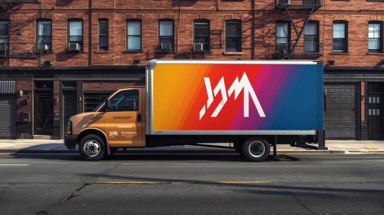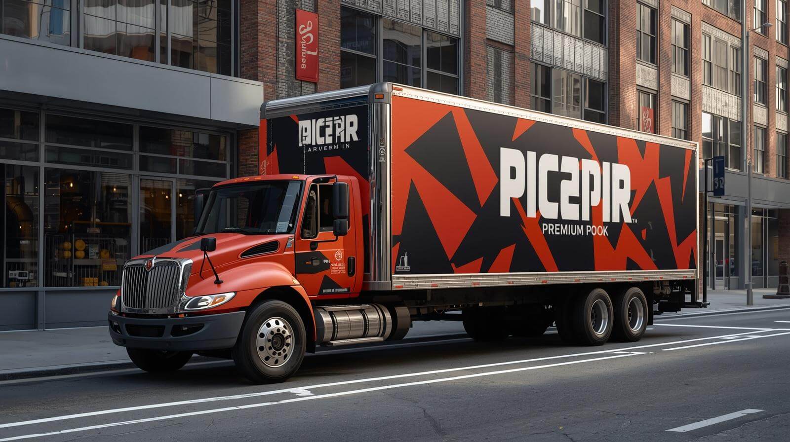
A vehicle graphic must be noticed before it can be read.
A wrap may use large lettering and accurate branding, but the message can still disappear if the colors blend together, the logo competes with a photograph, or contact information sits across a wheel well and door handle.
Visibility and readability are related but different. Visibility determines whether an element attracts attention. Readability determines whether the viewer can understand it after noticing it.
At Pixel Wraps, we consider both. We use color, contrast, scale, spacing, and placement to establish what people notice first and what information they can understand during the available viewing time.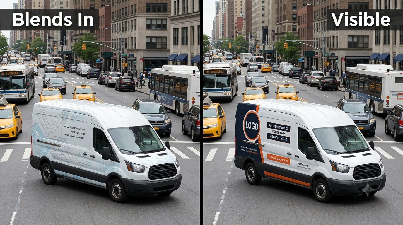
Visibility Comes Before Comprehension
A person cannot read information they never notice.
During the first glance, the viewer is responding to visual characteristics such as:
- Contrast
- Brightness
- Edges
- Color differences
- Faces
- Scale
- Position
- Direction
- Unusual shapes
3M’s Visual Attention Software evaluates first-glance visual attention using factors that include edges, intensity, red-green contrast, blue-yellow contrast, and faces. The tool is designed to predict which areas are likely to attract attention before conscious viewing begins. 3M Visual Attention Software support
Attracting attention is only the first step. The most noticeable area should contain something important.
If the brightest part of a wrap is a decorative icon while the company name disappears into the background, the design is directing attention to the wrong place.
Decide What Should Be Seen First
Every vehicle wrap needs a visual entry point.
This is usually one of the following:
- Company name
- Logo
- Primary service
- Hero image
- Strong graphic shape
For most commercial fleets, the company name or primary service should lead. Supporting imagery and secondary information should direct the eye toward those elements rather than away from them.
A useful priority may be:
- Company name or logo
- Business category
- Contact information
- Supporting message
- Decorative graphics
The design should still work if the viewer only notices the first two levels.
Color Choice and Color Contrast Are Different
Bright color does not automatically create strong contrast.
Yellow may be highly visible, but yellow lettering on a white vehicle can be difficult to read. Dark blue can be effective when placed against white but may disappear on black or charcoal paint.
Contrast depends on the difference between foreground and background.
Examples of stronger combinations include:
- White on dark navy
- Black on yellow
- Dark blue on white
- White on red
- Black on bright orange
- Dark green on white
Potentially weaker combinations include:
- Yellow on white
- Light gray on silver
- Red on dark blue
- Medium blue on dark gray
- Light green on white
- Orange on red
The International Sign Association notes that high-contrast signs are easier to read and gives yellow on white as an example of a lower-contrast combination. ISA glossary of sign terms
These examples are starting points rather than universal rules. Letter size, font weight, surrounding colors, finish, lighting, and viewing distance also affect the result.
Test the Design in Grayscale
Removing color provides a quick way to evaluate light-dark separation.
If the company name, service, and phone number disappear when the mockup is converted to grayscale, the design may depend on hue differences without enough value contrast.
A grayscale test can reveal:
- Text blending into the background
- Logo elements merging
- Photographs competing with typography
- Weak separation between graphic shapes
- Contact details losing priority
- Too many elements with equal visual weight
A strong color design should still retain a clear hierarchy when viewed without color.
This does not mean every element needs maximum black-and-white contrast. Secondary graphics can remain quieter. The important information should not rely on color alone to remain visible.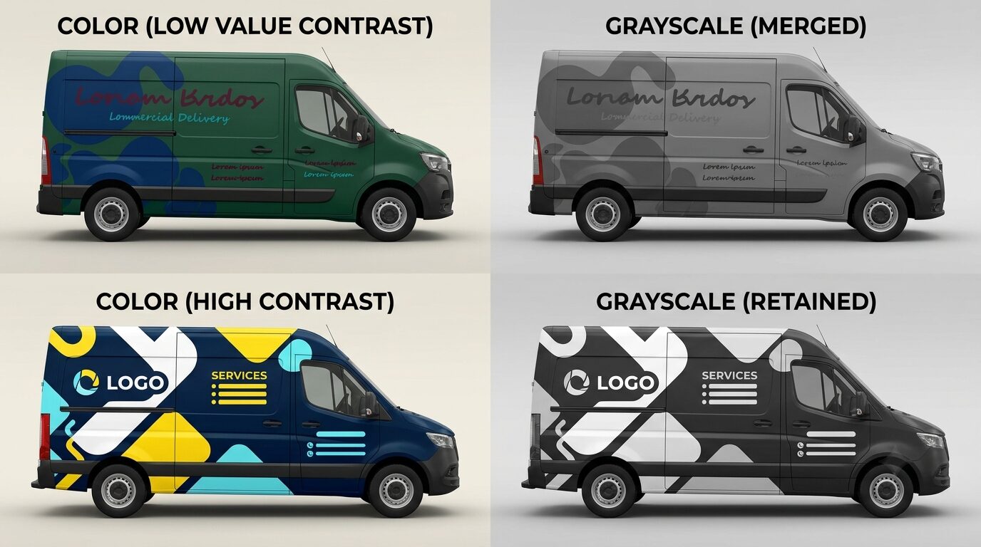
Use Brand Colors Without Sacrificing Visibility
A company may have brand colors that were developed for websites and printed materials rather than vehicles.
A pale color palette can still work, but it may need:
- Dark background panel
- White or black typography
- Stronger accent color
- Opaque logo field
- Heavier font weight
- More open space
- Increased logo size
- Controlled outline
The solution should preserve the identity rather than replace it with unrelated bright colors.
For example, a company with light blue and soft green branding might use those colors in large graphic shapes while placing the main logo and service description on a dark navy field.
Pixel Wraps can develop printed color samples so the customer evaluates the actual output rather than relying only on screen color.
Treat the Vehicle Paint as a Design Color
Partial wraps and vehicle lettering leave portions of the factory paint visible.
That paint becomes part of the composition.
A design for a white van may not transfer successfully to:
- Black pickup
- Silver SUV
- Red service truck
- Blue cargo van
- Metallic gray car
The original color affects:
- Logo contrast
- Partial-wrap boundaries
- Printed-color appearance
- Amount of coverage required
- Light or dark logo selection
- Overall fleet consistency
Before designing a mixed-color fleet, decide whether the graphics will:
- Work directly with each vehicle color
- Use a common opaque background
- Cover selected panels
- Use light and dark variants
- Bring every vehicle toward one dominant brand color
A partial wrap should look deliberately integrated with the paint, not like an incomplete full wrap.
Give Important Information Its Own Visual Field
Text becomes easier to notice and read when it has a controlled background.
Useful techniques include:
- Solid color bar
- Opaque panel
- Open negative space
- Simplified gradient
- Reduced image detail
- Contrasting shape
- Consistent contact-information block
A phone number placed directly over a detailed photograph may look energetic in the mockup but become difficult to distinguish on the road.
A solid or simplified field behind the contact information creates separation and gives the viewer a predictable place to look.
Avoid Using Outlines as the Only Solution
Outlines can help separate text from a background, but they are frequently overused.
A thin outline may disappear at a distance. A thick outline can distort the letterforms. Multiple outlines can make the design look dated and reduce clarity.
If text requires several outlines, shadows, and glows to remain visible, the background may be the actual problem.
A stronger solution may be:
- Move the text
- Simplify the image
- Add a solid field
- Change text color
- Increase size
- Reduce the message
- Use a heavier typeface
Effects should support the typography rather than compensate for weak placement.
Control the Number of Dominant Colors
Using every available brand color at equal intensity can make the wrap visually noisy.
A clearer system may assign:
- One dominant color
- One supporting color
- One accent color
- One neutral color
The dominant color establishes recognition. The supporting color creates structure. The accent draws attention to selected details. The neutral color provides space and contrast.
If every element is bright red, yellow, green, and blue, none of them establishes priority.
The accent color should be reserved for something meaningful, such as:
- Phone number
- Service category
- Call to action
- Graphic direction
- Department identifier
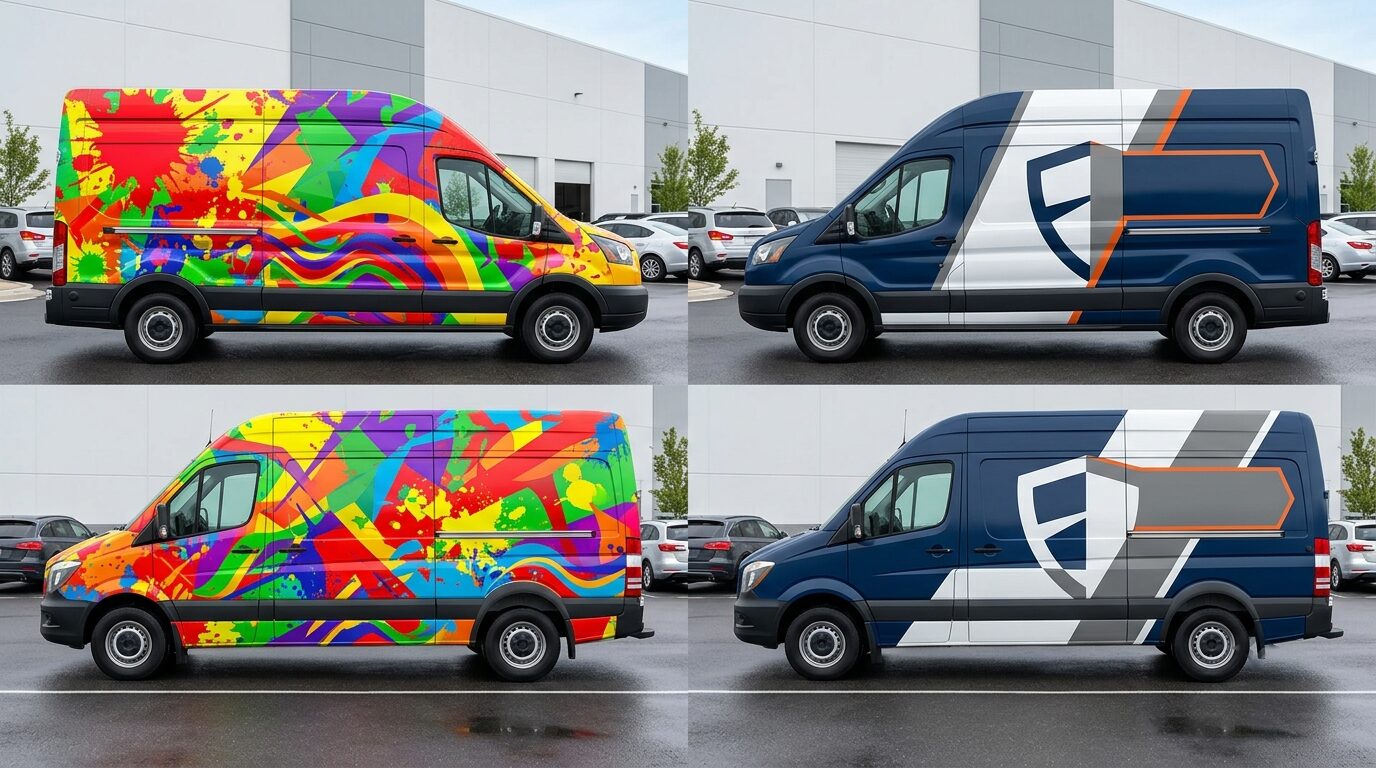
Use Photography Without Losing the Message
Photography naturally attracts attention, especially when it includes faces, food, finished projects, or dramatic scenes.
That attention can help or hurt.
A large food image may be appropriate for a food truck. A finished landscape may support a landscaping business. A clean interior can help a restoration or remodeling company.
Problems occur when:
- The photograph becomes more noticeable than the logo
- Several images compete
- Text crosses detailed areas
- Faces land behind handles
- Products are split by doors
- Image colors conflict with the brand
- Low-resolution images are enlarged
- The photograph does not represent the real service
If the viewer remembers the stock-photo family but not the contractor’s name, the image has become the main advertisement.
Photography should point the eye toward the brand or service—not become an unrelated visual destination.
Consider Color Meaning Without Depending on Clichés
Industries often repeat the same color conventions:
- Blue for plumbing and cleaning
- Green for landscaping
- Red for emergency service
- Yellow for construction
- Orange for electrical or HVAC
- Black for luxury automotive services
These associations can help people identify a category, but they also make competitors look similar.
A company can retain industry familiarity through the service wording and imagery while using a more distinctive brand palette.
For example:
- A plumber can use navy and warm orange instead of several shades of water blue.
- A landscaper can combine dark charcoal with controlled green rather than covering the vehicle in foliage.
- A restoration company can use a strong emergency accent without making the vehicle resemble an ambulance.
- A contractor can use architectural neutrals with one bright identification color.
The service should remain clear even when the colors are less predictable.
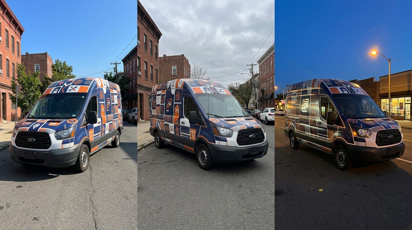
Design for Sunlight, Shade, and Glare
Vehicle graphics are viewed under changing outdoor conditions.
Direct sunlight can reduce the apparent depth of lighter colors. Shade can make dark combinations merge. Gloss surfaces can produce reflections. Metallic vehicle paint can shift with viewing angle.
Test the design under:
- Bright sunlight
- Open shade
- Overcast light
- Indoor lighting
- Low-angle morning or evening light
- Wet conditions
- Artificial street lighting
Finish also matters.
Gloss
- Strong color and visual depth
- Similar appearance to automotive paint
- Can produce noticeable reflections
Matte
- Reduced shine
- Distinct visual character
- May alter how dark colors appear
- Requires appropriate care
Satin
- Between gloss and matte
- Controlled reflection
- Can provide a refined appearance
The selected finish should support the design and maintenance requirements. It should not be chosen only from a small sample viewed indoors.
Use Reflective Material With Purpose
Reflective film can increase visibility when headlights or other light sources strike the material.
It may be useful for:
- Utility fleets
- Emergency-response vehicles
- Roadside services
- Nighttime delivery fleets
- Rear accents
- Logos
- Safety markings
- Selected contact information
ORAFOL describes its ORALITE 5600 as a reflective film developed for emergency and commercial vehicle markings, designed to return light from sources such as headlights and streetlights. ORAFOL ORALITE 5600 fleet film
Reflective film should not be treated as an ordinary printed color. Its construction, appearance, application, and regulatory role may differ.
It also should not be used to imitate emergency-vehicle markings on a standard commercial fleet.
Place the Logo Where the Vehicle Supports It
The largest empty area is not always the best logo position.
A suitable location should account for:
- Viewing angle
- Door operation
- Body lines
- Handles
- Windows
- Wheel wells
- Equipment
- Panel curvature
- Typical parking orientation
- Side and rear exposure
A logo crossing a sliding door may work when closed but disappear during service. A logo placed low on a pickup bed may be covered in mud. A logo centered on a box truck may be interrupted by a side door.
The logo should occupy a surface that remains visible during normal use.
Keep Important Information Away From Visual Friction
Visual friction occurs where the body makes information harder to process.
Common friction areas include:
- Door seams
- Handles
- Fuel doors
- Wheel wells
- Deep recesses
- Rivet rows
- Corrugations
- Liftgates
- Reflective tape
- Windows
- Body trim
- Curved bumpers
Some graphics can cross these areas successfully, but critical text should not depend on several interrupted surfaces aligning perfectly.
A decorative shape can pass through a handle. A phone number should not.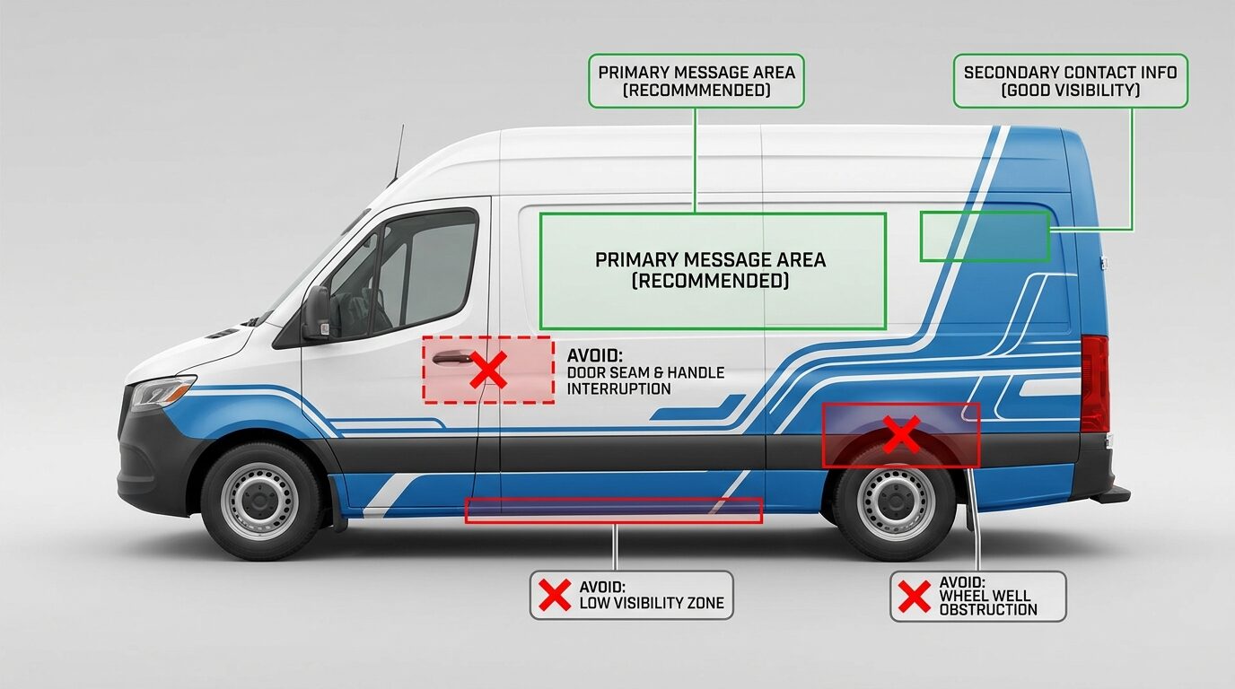
Give the Side and Rear Different Jobs
The side and rear are viewed under different conditions.
Side Graphics
The side is often seen while vehicles pass each other or while the commercial vehicle is parked.
Prioritize:
- Company name
- Business category
- Main visual identity
- Selected supporting message
- Contact method
Rear Graphics
The rear may remain visible longer in traffic but contains more hardware.
Prioritize:
- Company name
- Primary service
- Phone number or website
- Required markings
- High contrast
The rear should not be a miniature copy of the side. It should be redesigned around doors, windows, cameras, handles, lights, lift equipment, and following distance.
Consider Which Direction the Vehicle Is Usually Viewed
A delivery truck parked with one side against a loading dock may expose its opposite side more often. A food truck has a customer-facing service side and a road-facing side. A contractor van may be viewed mainly from the curb and rear.
Ask:
- Which side faces traffic?
- Which side faces customers at job sites?
- Is the vehicle commonly backed into spaces?
- Does the service door remain open?
- Is one side regularly blocked?
- Is the vehicle seen from above?
- Does a trailer travel with the same tractor?
- Is the vehicle parked indoors between routes?
The design can remain consistent while assigning different information to each side according to use.
Place Contact Information Where It Can Be Retained
Contact information needs visibility, but it should not compete with the company identity.
A person who remembers the company name can search for it later. A person who only sees a phone number without understanding the service has little reason to remember it.
The contact method should follow the brand and business category.
Useful placements include:
- Lower but unobstructed side panel
- Pickup bed
- Rear doors
- Box-truck side beneath the primary message
- Solid contact-information bar
- Rear quarter panel on a car or SUV
Avoid:
- Thin text along the rocker panel
- Phone numbers across wheel wells
- Website over a detailed photograph
- QR codes as the only response path
- Multiple competing phone numbers
- Long URLs
Check the Design at Different Scales
A design can look balanced when viewed as a whole and fail when seen at realistic size.
Review it in several ways:
- Full vehicle mockup
- Thumbnail
- Grayscale
- Blurred view
- Three-second view
- Side-by-side with competitors
- Real-size printed section
- Mobile screen
- Large monitor
- Actual installation pilot
The blurred test is useful for checking hierarchy. When detail disappears, the dominant shapes and color fields remain. Those are the areas most likely to control the first impression.
3M states that vehicle graphics may have only three to five seconds to direct attention and recommends analyzing whether the most critical part of the wrap receives that attention. 3M vehicle graphics design guidance
Use Visual-Attention Tools as Support, Not Final Approval
Predictive tools can help identify areas likely to receive first-glance attention.
They can reveal whether the design emphasizes:
- Logo
- Face
- Bright graphic edge
- Phone number
- Photograph
- Empty area
- Unimportant decoration
However, software cannot fully account for every real vehicle condition:
- Body curvature
- Door operation
- Reflections
- Traffic
- Partial obstruction
- Dirt
- Viewing angle
- Vehicle speed
- Installation details
Use attention analysis alongside full-size review, vehicle photographs, production knowledge, and real-world testing.
Verify Printed Color Before Fleet Production
Screen color is not a finished production standard.
Printed output can change according to:
- Printer
- Ink
- Wrap film
- Laminate
- Color profile
- Lighting
- Surface finish
- Vehicle paint
- Production settings
Important colors should be reviewed through printed samples. The approved sample can then become a reference for later vehicles and replacement panels.
At Pixel Wraps, we manage printing and lamination in-house, giving our design and production teams a direct path for reviewing color before the graphics are installed.
Make the Right Information the Most Visible
A commercial wrap succeeds when attention leads to understanding.
Pixel Wraps develops vehicle graphics around:
- Brand color
- Printed color
- Contrast
- Visual hierarchy
- Message placement
- Vehicle body lines
- Viewing angle
- Side and rear exposure
- Daytime and nighttime conditions
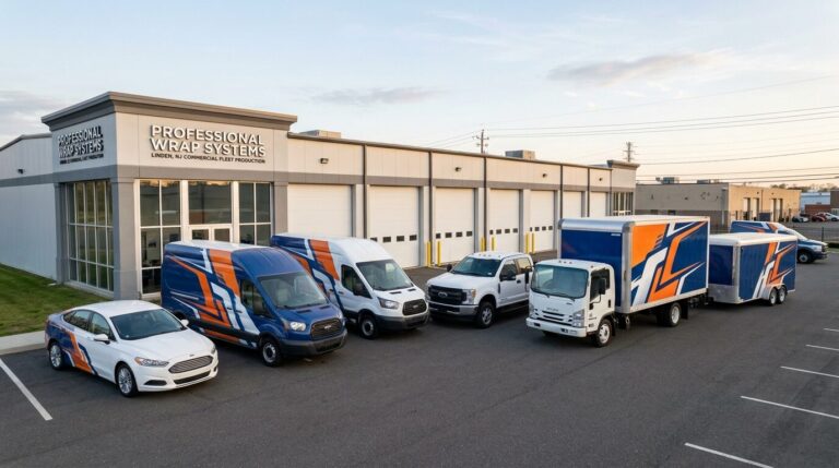
- Fleet consistency
- Material selection
- Full-size production
We design, print, laminate, and install commercial vehicle graphics for businesses throughout New York City, New Jersey, Pennsylvania, and the tri-state area.
Contact Pixel Wraps with your vehicle information and brand files. We will help organize the colors, graphics, and message so the most important parts of the wrap receive the attention they deserve.