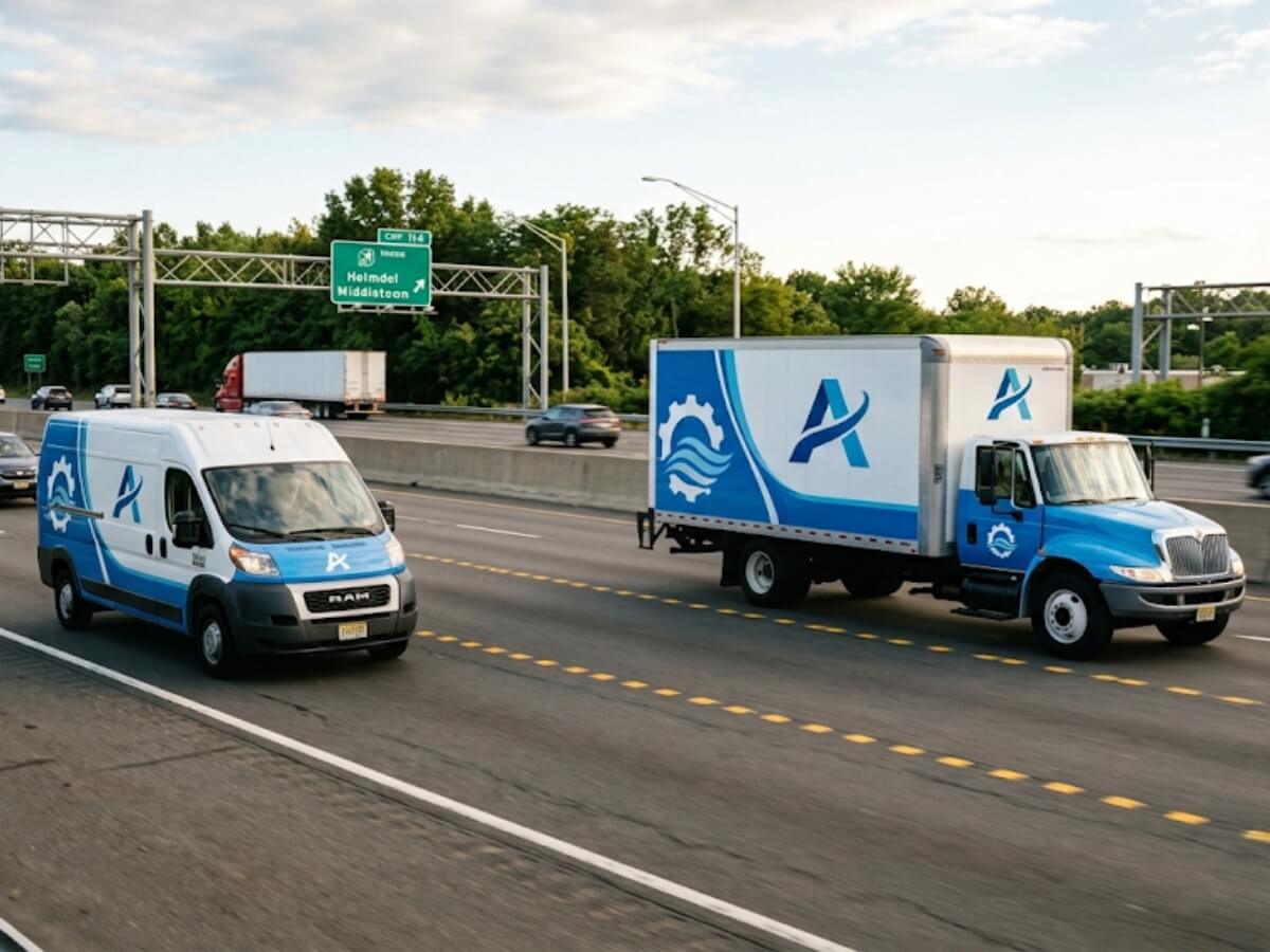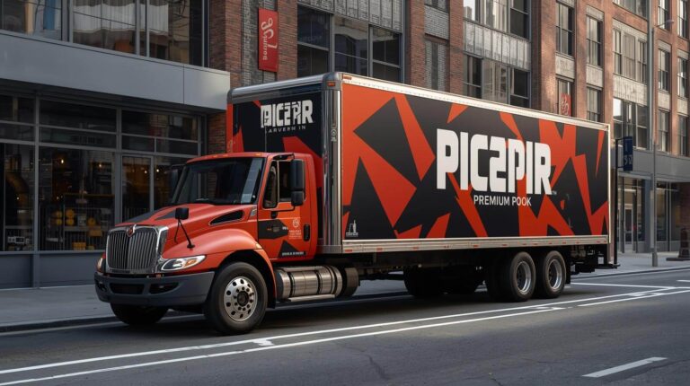
A commercial vehicle may only remain within a person’s clear field of view for a few seconds. During that time, the viewer must identify the company, understand what it does, and remember a way to respond.
That is a very different design problem from a brochure, website, or stationary sign.
Vehicle graphics need to work while the vehicle is moving, while the viewer is moving, or while both are surrounded by traffic. The design must also account for distance, glare, weather, body lines, open doors, other vehicles, and limited viewing angles.
At Pixel Wraps, we design commercial wraps around these real-world conditions. The goal is not to fit the greatest amount of information onto the vehicle. It is to make the most important information visible, readable, and recognizable in the time available.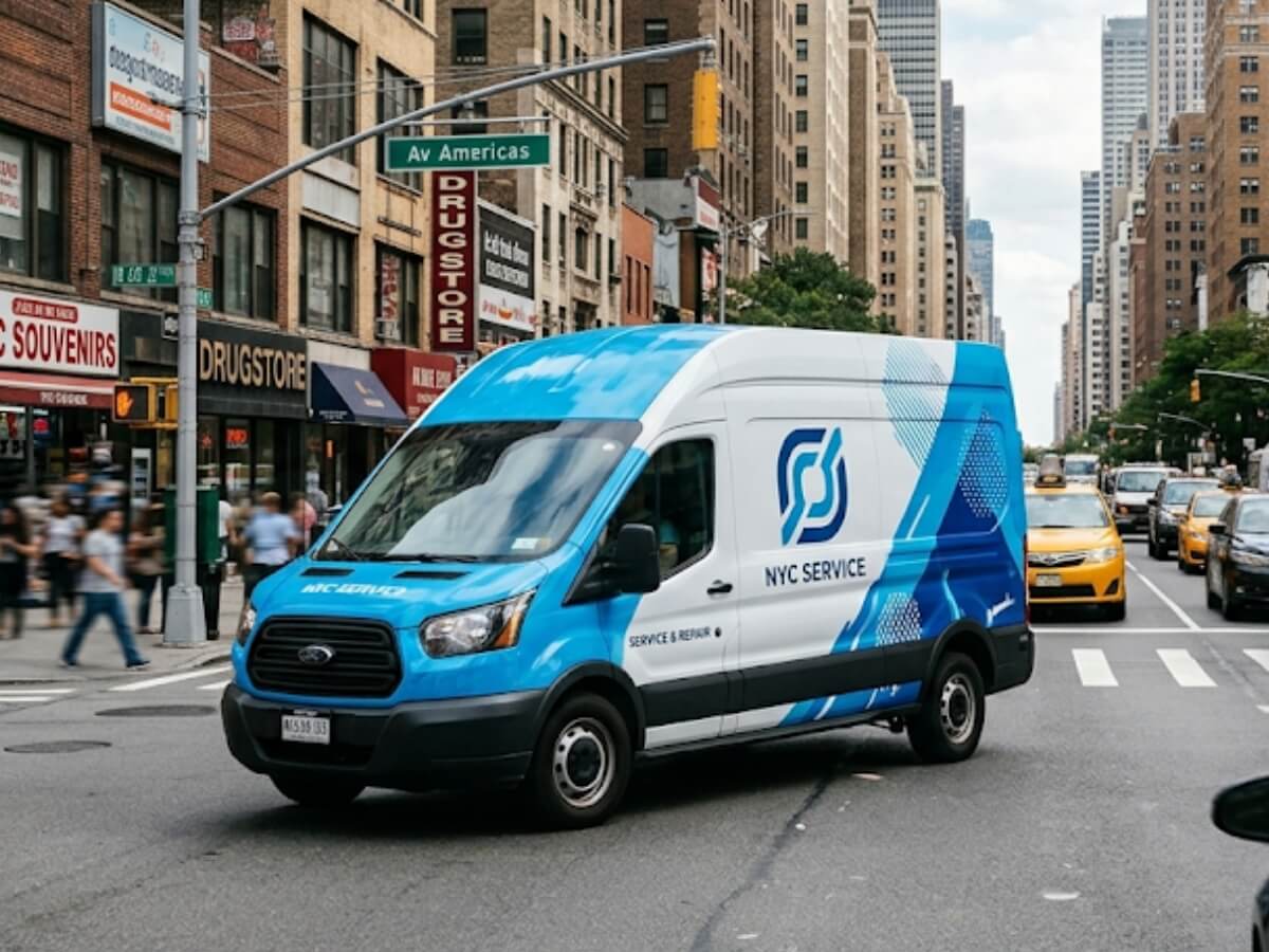
Design for a Glance, Not a Long Read
A parked customer may study a vehicle for several minutes. A driver passing in the opposite direction will not.
The primary design must be understandable in a brief glance. Additional information can serve people who see the vehicle while it is parked, but it should not compete with the main roadside message.
A viewer should be able to answer three questions quickly:
- Who is the company?
- What does the company do?
- How can I find or contact it?
If the design requires someone to read a long service list before understanding the business, the hierarchy is working backward.
The company name or logo and primary service should provide the answer immediately. Contact information should be simple enough to retain or locate later.
Decide What Must Be Read First
Every design needs a deliberate order of attention.
A typical commercial vehicle hierarchy may be:
- Company name or logo
- Primary business category
- Short supporting message
- Phone number or website
- Selected services
- License, DOT, MC, or vehicle information
The exact order can change. A well-known brand may prioritize its logo. A less familiar company may need a clear description such as “Plumbing and Heating” to explain what the name alone does not communicate.
The largest element should not be chosen only for appearance. It should be the information the business most needs a viewer to notice.
Reduce the Message Before Reducing the Text
When a layout becomes crowded, the first response is often to make everything smaller.
That usually weakens the entire vehicle.
A better sequence is:
- Remove repeated information
- Shorten the wording
- Combine related services
- Remove low-priority claims
- Select one primary response method
- Increase spacing
- Reevaluate the layout at full size
For example, a contractor does not need to list:
- Residential roofing
- Commercial roofing
- Roof inspections
- Roof maintenance
- Roof repairs
- Emergency roof repairs
- Roof replacement
- New roof installation
A stronger moving-traffic message may be:
Roofing, Repairs and Replacement
Additional services can appear on the website, rear panel, or a section likely to be viewed while parked.
Letter Size Must Match Viewing Distance
Text that is readable on a computer screen may be far too small on a vehicle.
Design software displays the whole vehicle at a reduced scale. A designer can zoom in and read six lines of services easily, but the customer will see the vehicle from across a street, through another windshield, or several car lengths away.
The International Sign Association cites a general sign-design recommendation of at least one inch of letter height for every 25 feet of viewing distance. International Sign Association design and placement guidance
Federal Highway Administration research and sign guidance also connect legibility distance with letter height and spacing. FHWA notes that sign messages must be readable and understood within the available viewing time and that larger letters generally provide greater legibility distance. FHWA guide-sign legibility discussion
These references concern stationary traffic and commercial signs, not a universal vehicle-wrap formula. A moving vehicle introduces additional variables:
- Vehicle speed
- Viewer speed
- Viewing angle
- Traffic
- Weather
- Glare
- Obstruction
- Contrast
- Font
- Message length
The practical lesson is straightforward: important vehicle text should be larger than it appears necessary on the design screen.
Test the Design at Real Size
A digital proof is necessary for approval, but it does not reproduce roadside viewing.
Print key information at actual size or view the design at a scale that accurately represents the intended distance. Test the logo, service category, phone number, and website separately.
A practical review can include:
- Viewing from 25 feet
- Viewing from 50 feet
- Viewing from across a parking lot
- Viewing from a vehicle at eye level
- Viewing from the rear
- Viewing at an angle
- Viewing in bright sunlight
- Viewing under lower light
- Viewing with doors open
- Viewing with ladders or equipment installed
Ask someone unfamiliar with the project what they noticed first and what they remember several minutes later. The internal team already knows the company name and may read information that a new viewer will miss.
Use Typefaces Built for Recognition
A decorative font may match the personality of the brand but still perform poorly on a moving vehicle.
Readable vehicle typography usually has:
- Clear letterforms
- Open counters
- Sufficient stroke weight
- Distinction between similar characters
- Adequate spacing
- Limited decorative detail
- Strong contrast from the background
Avoid using condensed or thin fonts for critical information unless they remain clear at the required size.
Phone numbers deserve special attention. Characters such as 1, 7, 0, 6, 8, and 9 must remain distinct. A stylized font that makes the brand name attractive may not be suitable for contact information.
The design can use more than one typeface, but the system should remain controlled. Too many fonts create competing visual voices and reduce hierarchy.
Give Letters Enough Space
Letter height is only part of readability. Spacing between characters, words, lines, and surrounding elements also matters.
Text becomes harder to recognize when:
- Letters are compressed
- Lines are packed tightly
- Words touch images
- Text sits against panel edges
- The phone number is broken awkwardly
- Multiple messages compete in the same area
- A busy pattern passes through the letters
FHWA guidance notes that sign legibility is directly related to letter size and spacing and that the viewer needs enough time to read and understand the message. FHWA guide-sign principles
Commercial vehicle graphics are not traffic-control signs, but the same basic visual principle applies: crowding reduces the time and distance over which a message can be understood.
Build Strong Color Contrast
A large message can still disappear if its color is too close to the background.
Effective contrast can come from:
- Light text on a dark field
- Dark text on a light field
- Solid background shapes
- Controlled outlines
- Clear space around the logo
- Reduced image detail behind text
- Consistent color blocks
Avoid relying on a thin outline to separate text from a highly detailed photograph. The design may look acceptable at close range but become visually noisy from the road.
Contrast should also be tested in grayscale. If the main elements blend together without color, the design may rely too heavily on hue differences rather than actual light-dark separation.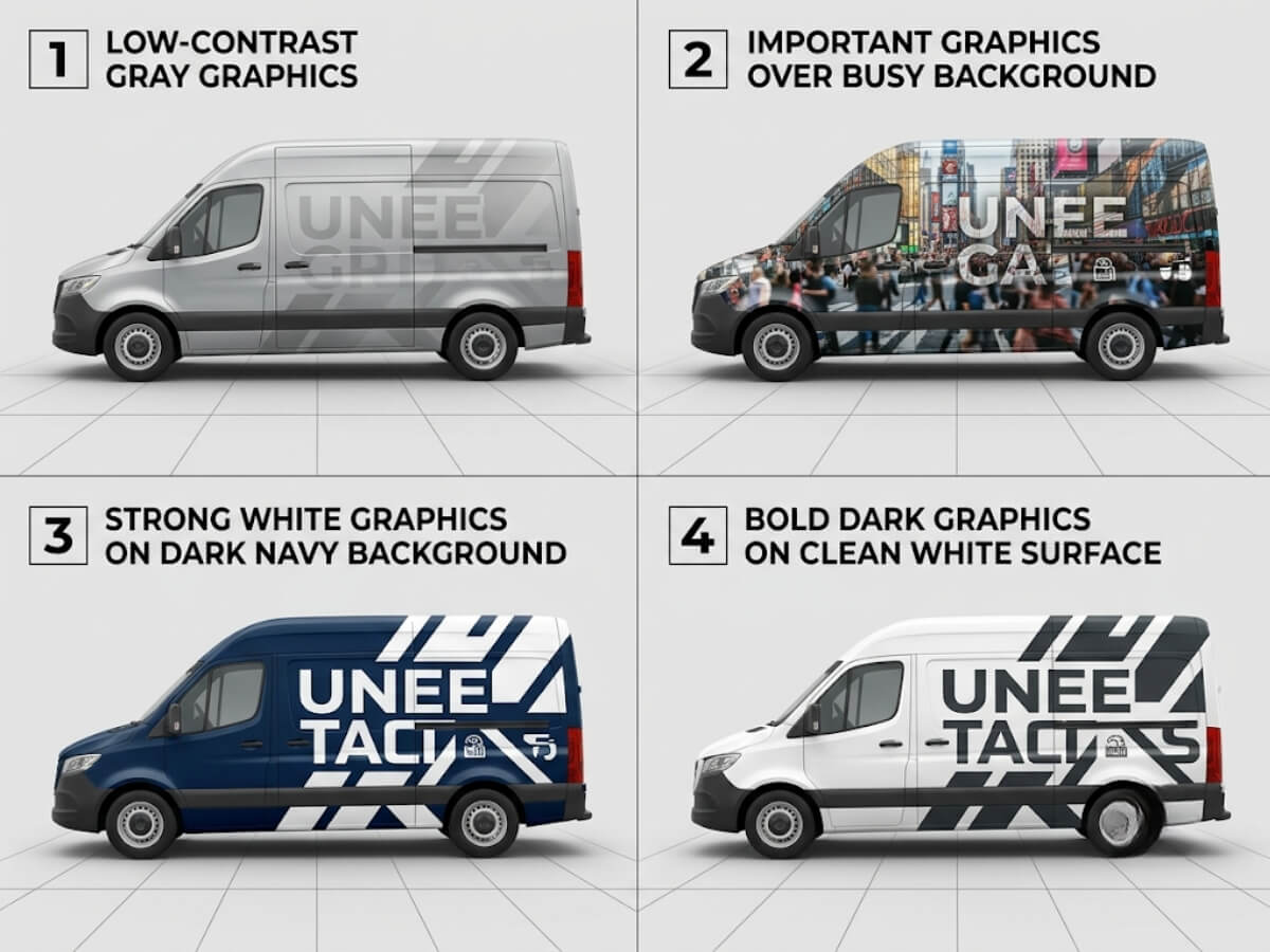
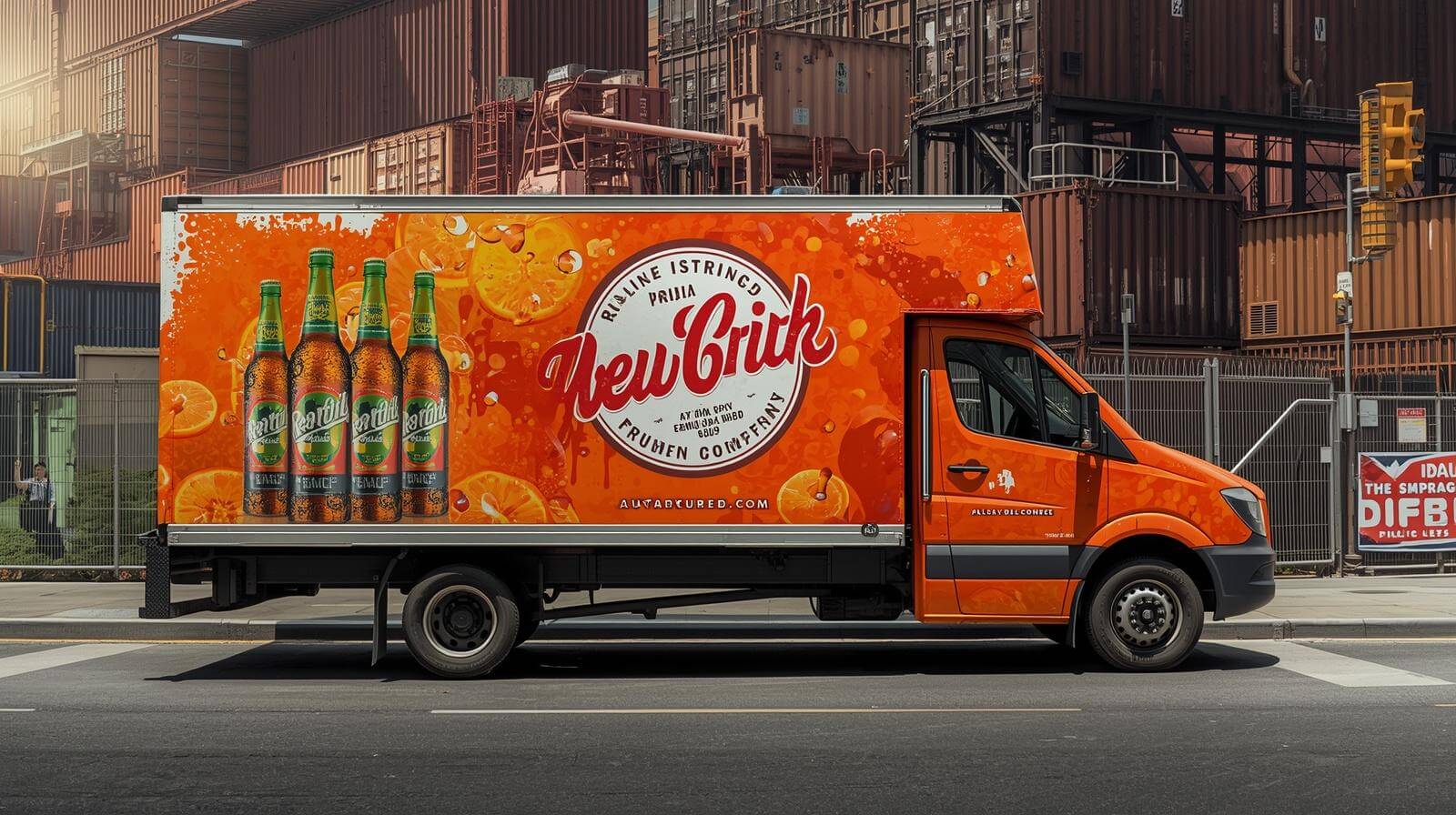
Do Not Let Photography Compete With the Message
Photography can help communicate food, construction, landscaping, cleaning, transportation, and other visually identifiable services. It can also make a wrap difficult to read.
A vehicle does not need to show every service visually.
If photography is used:
- Choose one strong image or a controlled image group
- Keep faces and products away from door seams
- Avoid placing important details over wheel wells
- Maintain contrast behind the text
- Use cropping that works with the body
- Reduce unnecessary background detail
- Avoid low-resolution source files
- Test the image at full vehicle size
The photograph should support the company name and service message. It should not become a separate advertisement competing for attention.
Use the Vehicle’s Shape to Guide the Eye
Vehicle body lines naturally influence how people scan the graphics.
A strong design can use:
- Door lines
- Wheel arches
- Character lines
- Window angles
- Cargo-box edges
- Hood direction
- Bed lines
- Trailer length
Graphic shapes can follow or work deliberately against these lines to direct attention toward the logo or message.
Problems occur when important information is placed where the vehicle breaks it apart:
- Logo crossing a sliding-door gap
- Phone number divided by two doors
- Letters passing behind handles
- Faces split by panel seams
- Website placed along a curved rocker panel
- Service line interrupted by a wheel well
The body should be treated as a three-dimensional surface, not a flat rectangle.
Design for Multiple Viewing Angles
A vehicle is rarely viewed from a perfect side elevation.
People see it:
- Approaching from the front
- Passing from the side
- Following from the rear
- Parked at an angle
- Partially blocked by another vehicle
- Stopped beside it in traffic
- Viewed from a sidewalk
- Viewed from an upper-floor window
- Seen with doors open
The main brand should remain identifiable from more than one angle.
This does not mean repeating every message on every panel. It means assigning each surface a clear role.
Side Panels
Best for the primary brand, service category, and larger visual message.
Rear Panels
Best for traffic viewing, a direct service message, and one contact method.
Front and Hood
Useful for brand recognition when space and vehicle configuration allow.
Roof
Relevant mainly where vehicles are viewed from elevated locations. It should not take priority over more visible surfaces unless the operating environment supports it.
Treat the Rear as Its Own Design
The rear of a commercial vehicle can remain in view longer than the side, particularly in traffic.
It is also one of the most mechanically complicated surfaces.
Rear designs may need to work around:
- Split doors
- Roll-up doors
- Hinges
- Handles
- Windows
- License plates
- Cameras
- Lights
- Steps
- Liftgates
- Reflective tape
- Safety markings
Keep the rear message direct. A company name, primary service, and one contact method may perform better than a reduced copy of the entire side design.
Place critical information where it will remain visible when the vehicle is loaded, parked, or fitted with operating equipment.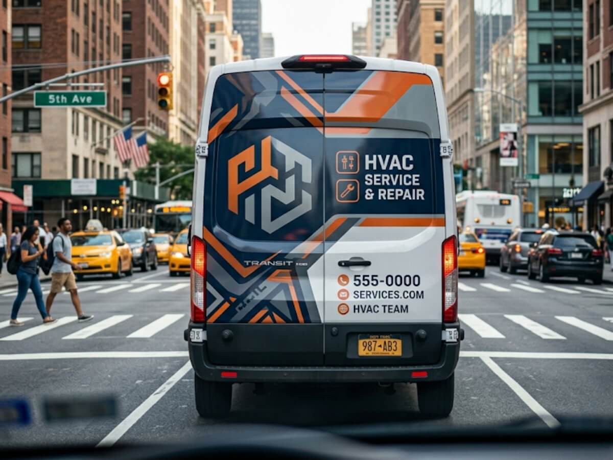
Check What Happens When Doors Open
A closed vehicle is not always its normal working condition.
Service vans may spend hours with sliding or rear doors open. Box trucks may operate with a liftgate lowered. Food trucks open service windows. Utility trucks expose compartments throughout the working day.
The design should be reviewed in each operational state.
Ask:
- Does the logo disappear when the door opens?
- Does the phone number split between panels?
- Does an open door create an unintended word?
- Is the company name hidden during service?
- Does the inside of a door expose unfinished graphics?
- Does the liftgate cover the contact information?
- Do utility doors reveal important text in fragments?
Sometimes repetition is appropriate. A secondary logo or website can remain visible when the primary panel is open. The repetition should solve an operational issue rather than fill empty space.
Keep Contact Information Simple
A vehicle wrap does not need every way to contact the business.
Possible response options include:
- Phone number
- Website
- Short URL
- QR code
- Social handle
- Physical address
Using all of them can make the design harder to scan.
For moving traffic, a recognizable brand name and short website may be easier to remember than a phone number. For local service vehicles parked at job sites, a phone number may be valuable. A QR code may work at events or while parked but should not be the main response method for moving traffic.
Choose contact information based on how and where the vehicles are seen.
Make the Business Category Clear
Some company names do not explain the service.
A name such as “Summit,” “Prime,” or “Metro” could represent construction, cleaning, delivery, insurance, or another industry. If the logo does not communicate the category, the wrap should.
Useful descriptors may include:
- HVAC and Plumbing
- Roofing and Siding
- Commercial Cleaning
- Moving and Storage
- Electrical Contractor
- Landscape Design
- Courier and Delivery
- Property Restoration
- Pest Control
- Mobile Veterinary Care
The category should be more prominent than a long list of individual services.
A viewer who understands the business can search for the company later, even if they do not remember every secondary detail.
Use Short Words and Familiar Language
Vehicle graphics are not the place for complicated marketing language.
Use terms customers recognize quickly. Replace internal terminology, industry jargon, and long claims with direct descriptions.
Instead of:
Integrated Residential Climate Optimization Solutions
Use:
Heating and Cooling
Instead of:
Comprehensive Exterior Building Envelope Services
Use:
Roofing, Siding and Gutters
The shorter version is easier to read and easier to remember.
Avoid Unsupported Claims
Phrases such as “best,” “number one,” and “most trusted” take up valuable space without explaining what the company does.
Specific proof points may be stronger when they are accurate:
- Licensed and Insured
- Family-Owned
- Serving Since 2001
- 24/7 Emergency Service
- Same-Day Service
- Certified Technicians
- Free Estimates
These claims should only be used when the business can support them. They also should not compete with the company name and primary service.
Consider Reflective Graphics for the Right Application
Reflective film can increase nighttime visibility when it is used intentionally.
It may be appropriate for:
- Emergency vehicles
- Utility fleets
- Roadside service vehicles
- Delivery vehicles operating after dark
- Rear safety markings
- Selected logos or accents
- DOT-related markings
Reflective material behaves differently from standard printed wrap film. It should be specified, printed, laminated, and installed according to the manufacturer’s requirements.
ORAFOL describes its ORALITE fleet films as reflective materials developed for emergency and commercial vehicle graphics, with reflected light contributing to visibility during darkness and poor weather. ORAFOL fleet reflective film information
Reflective film does not correct a weak layout. The underlying message still needs appropriate size, hierarchy, contrast, and placement.
Test the Design in Motion
A final wrap proof should be reviewed under simulated or actual moving conditions before broad fleet production.
Possible tests include:
- Shrinking the design to a realistic viewing size
- Viewing it for only three to five seconds
- Showing it to someone unfamiliar with the brand
- Reviewing it from a moving vehicle where safe
- Printing a large section at scale
- Placing a temporary print on the vehicle
- Testing side and rear views
- Reviewing daylight and low-light conditions
Ask the reviewer to recall:
- Company name
- Type of business
- Contact method
- Main visual impression
If the reviewer remembers decorative details but cannot identify the company or service, the hierarchy needs to change.
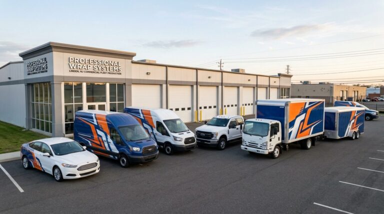
Design for Recognition Across the Entire Fleet
A readable vehicle is valuable. A readable fleet is stronger.
The logo, colors, fonts, message hierarchy, and contact treatment should remain connected across trucks, vans, trailers, buses, and cars. The exact layout can adapt, but the recognition system should remain consistent.
Pixel Wraps creates vehicle-specific designs around a shared fleet identity. We account for the size and shape of each vehicle while keeping the brand clear across the complete program.
Make Every Second of Viewing Time Count
A commercial vehicle wrap does not need to communicate everything about the business. It needs to communicate the right things quickly.
Pixel Wraps designs, prints, laminates, and installs commercial vehicle graphics for businesses across New York City, New Jersey, Pennsylvania, and the tri-state area.
Our team considers:
- Viewing distance
- Traffic conditions
- Text size
- Message hierarchy
- Brand recognition
- Color contrast
- Vehicle body lines
- Doors and equipment
- Side and rear visibility
- Fleet consistency
- Material performance
- Final installation
From one service van to a mixed commercial fleet, we develop graphics that work on the road—not only on the design screen. Contact Pixel Wraps with your vehicle information and brand files, and we will help organize the message into a wrap people can recognize and understand.