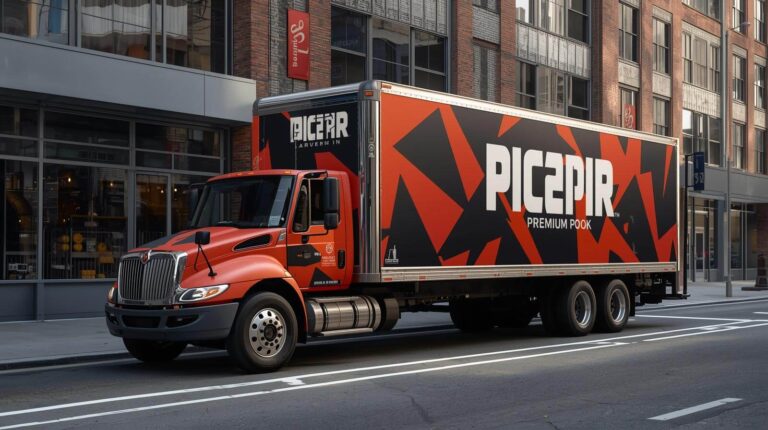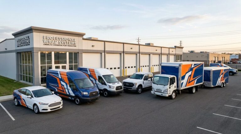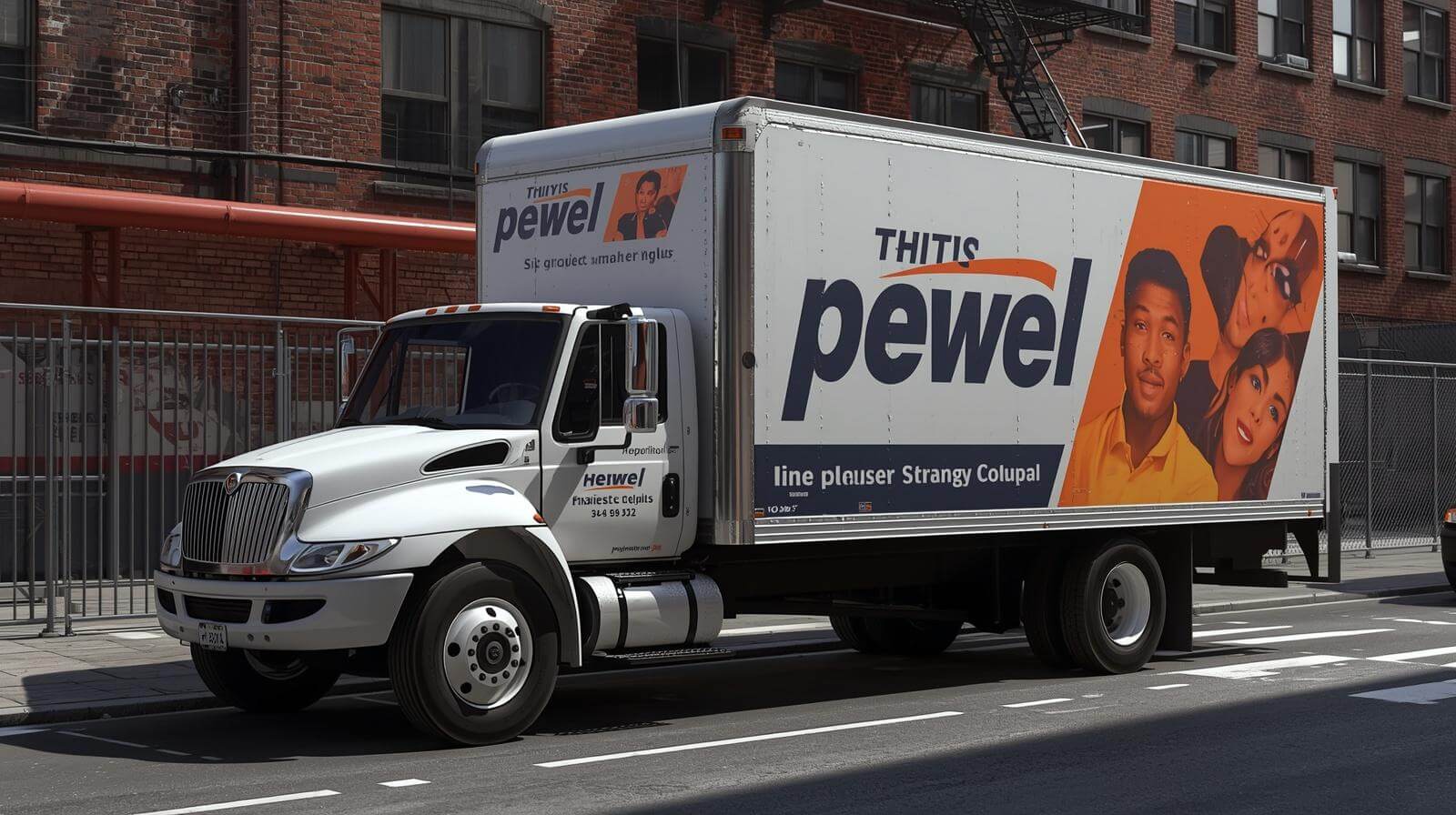
A commercial vehicle wrap should do more than place a logo on a truck or van. It should help people understand the business within a few seconds.
The most effective message, imagery, and layout depend on the industry. A plumbing van needs to build local trust and communicate service availability. A moving truck needs to remain recognizable from a distance. A food truck must support both branding and on-site sales. A logistics trailer may need a much simpler message that can be understood at highway speeds.
At Pixel Wraps, we adapt the design to the business, vehicle type, working conditions, and customer. The following ideas are not fixed templates. They are practical starting points for developing graphics that fit how each industry operates. 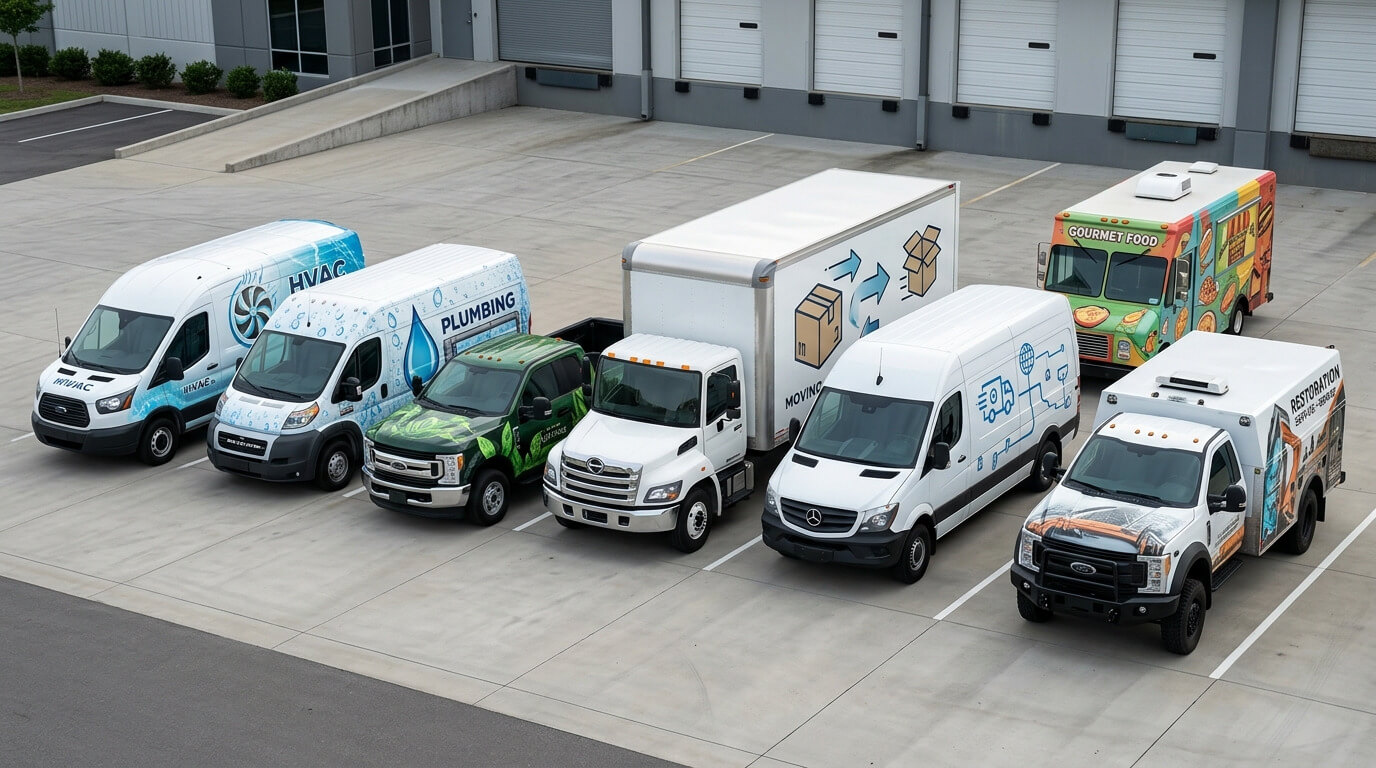
Begin With the Customer’s Immediate Question
Different customers look for different information.
A homeowner seeing an HVAC van may want to know whether the company handles heating emergencies. A property manager seeing a cleaning vehicle may be more interested in commercial service. A customer approaching a food truck needs to understand the menu concept.
The design should answer the customer’s most immediate question before adding secondary details.
That usually means establishing:
- Company name
- Type of service
- Main point of difference
- Service area where useful
- One clear response method
- Required operational or regulatory information
The industry determines which of these elements deserves the most attention.
HVAC and Plumbing Vehicle Wraps
HVAC and plumbing companies often operate cargo vans, high-roof vans, pickups, and box trucks. These vehicles spend significant time in residential neighborhoods, commercial parking lots, and outside customer properties.
The wrap should make the service category immediately clear. A creative company name does not always explain whether the business handles plumbing, heating, cooling, or all three.
Recommended Message Hierarchy
- Company name or logo
- HVAC, plumbing, or combined service category
- Emergency or scheduled service information
- Phone number or short website
- Selected services
- License information where required
Useful Design Directions
- Bold brand colors with strong contrast
- Large service category
- Heating and cooling symbols used sparingly
- Water, airflow, or temperature-inspired graphic forms
- Separate visual treatment for plumbing and HVAC divisions
- A clean contact-information bar
- Rear-door layout designed for traffic
- Department or vehicle numbering
What to Avoid
- Listing every repair service
- Generic stock photos of technicians
- Overusing flames, snowflakes, water drops, and tool icons together
- Placing the emergency number too low
- Hiding the logo behind sliding doors or ladders
- Claims such as “best” without meaningful support
A short message such as Heating, Cooling and Plumbing is generally more useful in traffic than a list of equipment brands and individual repairs.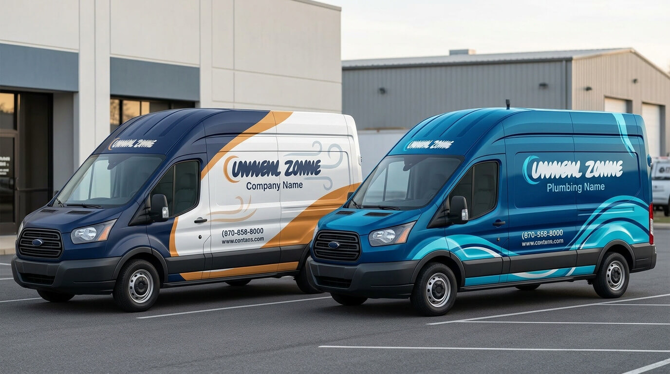
Electrical Contractor Vehicle Wraps
Electrical contractors need graphics that communicate technical capability and reliability without making the vehicle resemble an emergency utility vehicle.
Common vehicles include service vans, pickups, utility trucks, and bucket trucks.
Recommended Message Hierarchy
- Company name
- Electrical contractor or electrician
- Residential, commercial, or industrial focus
- Phone number and website
- License information where required
Useful Design Directions
- Strong geometric lines
- Controlled use of yellow, orange, or electric blue
- Circuit-inspired patterns
- Architectural or grid-based composition
- Clear distinction between residential and commercial services
- Reflective accents for vehicles operating after dark
- Simplified graphics around utility compartments
What to Avoid
- Dense lightning-bolt patterns
- Excessive electrical symbols
- Small lists of panel, outlet, lighting, and wiring services
- Graphics covering compartment labels
- Designs easily confused with municipal or emergency vehicles
For industrial or commercial electrical companies, a structured design can communicate capability more effectively than playful illustrations.
Construction and General Contractor Wraps
Contractors may operate pickups, utility trucks, cargo vans, dump trucks, box trucks, and trailers. Equipment frequently blocks portions of these vehicles, so the design must account for ladders, racks, toolboxes, and open compartments.
Recommended Message Hierarchy
- Company name
- General contractor or primary trade
- Core project category
- Website or phone number
- License information where required
Useful Design Directions
- Strong typography
- Architectural lines or structural forms
- Controlled use of project photography
- Clear residential or commercial positioning
- Simplified door graphics for pickups
- Large trailer branding
- Consistent design across trucks and equipment trailers
What to Avoid
- Long lists of every construction service
- Several unrelated project photographs
- Small before-and-after images
- Placing contact details where ladders will cover them
- Using tools as the primary identity
- Overly distressed textures that weaken readability
A contractor offering many services can group them under broader categories such as:
- Remodeling
- Commercial Interiors
- Roofing and Exteriors
- Concrete and Masonry
- Design and Build
Roofing and Exterior Service Wraps
Roofers, siding contractors, gutter companies, and exterior-remodeling businesses often use pickups, cargo vans, box trucks, and trailers.
These vehicles may remain parked at job sites for hours, creating both moving and stationary exposure.
Useful Design Directions
- Strong roofline or architectural form
- Clear primary service
- High-contrast phone number
- Website suitable for later brand search
- One high-quality finished-project image
- Certification or manufacturer credentials where accurate
- Rear graphics readable in traffic
- Yard-sign and vehicle-brand consistency
Avoid filling the vehicle with roof diagrams, material samples, and multiple property photos. One strong visual and a direct service description usually create a cleaner impression.
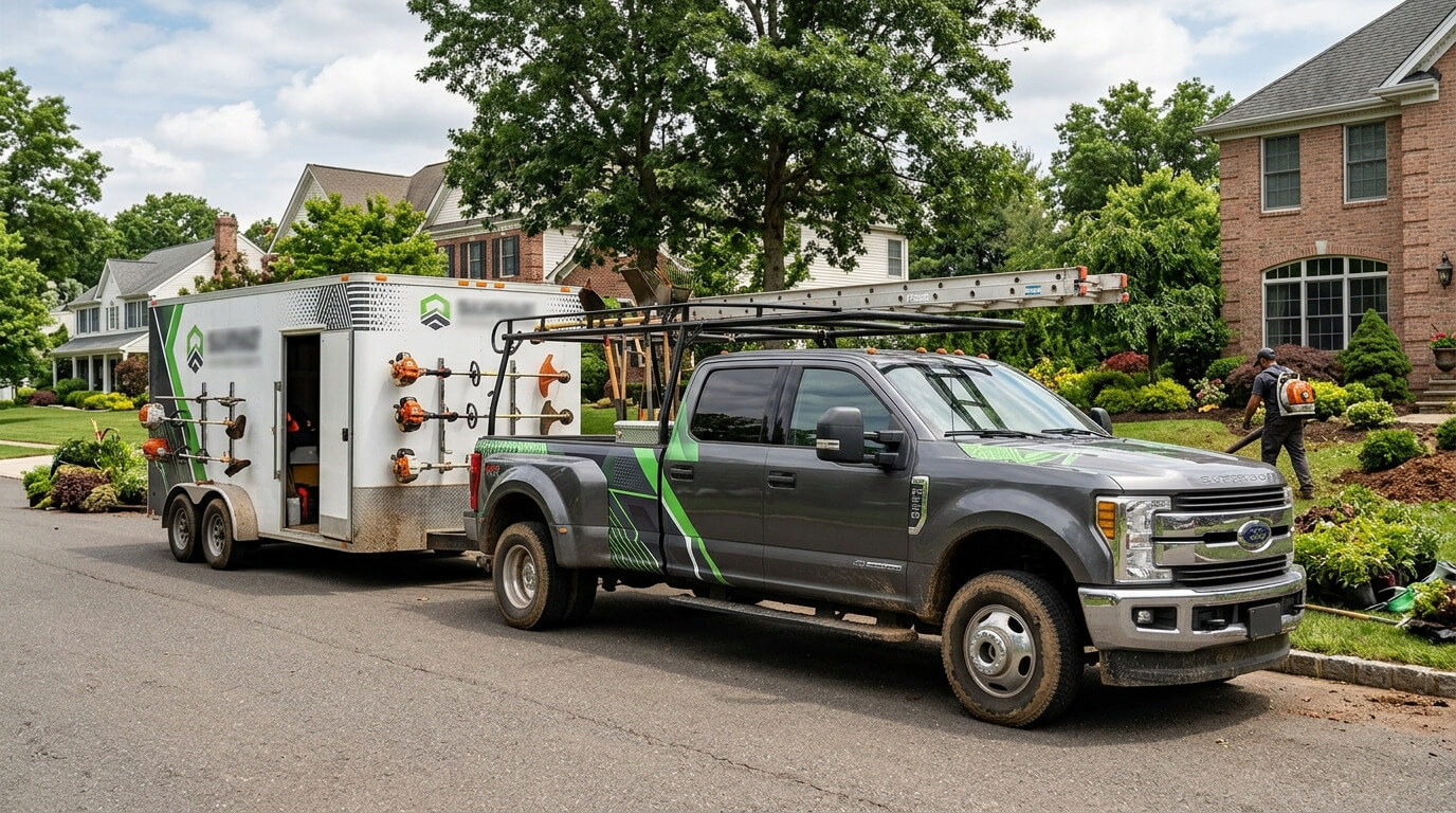
Landscaping and Tree Service Wraps
Landscaping fleets may include pickups, dump trucks, trailers, vans, and specialized equipment. The vehicles are frequently exposed to mud, branches, tools, and heavy use.
The design should remain recognizable even when parts of the vehicle are dirty or equipment is attached.
Recommended Message Hierarchy
- Company name
- Landscaping, lawn care, tree service, or hardscaping
- Phone number or website
- Major service category
- License or certification details where applicable
Useful Design Directions
- Natural colors balanced with a strong contrasting field
- Simplified leaf, terrain, or landscape forms
- Finished-property photography used selectively
- Bold logo placement on trailer sides
- Contact information high enough to remain visible
- Separate color system for maintenance and construction divisions
- Replaceable graphics in high-wear areas
What to Avoid
- Camouflage-like combinations of green and brown
- Detailed foliage behind small text
- Placing information near trailer fenders
- Using several plant and equipment illustrations
- Important graphics on surfaces regularly hit by debris
Moving and Storage Truck Wraps
Moving companies have access to some of the largest vehicle advertising surfaces. Box trucks, straight trucks, vans, and trailers can carry strong branding visible across long distances.
The size of the vehicle does not mean every inch should contain information.
Recommended Message Hierarchy
- Company name
- Moving and storage
- Local, long-distance, commercial, or residential focus
- Phone number and website
- License or motor-carrier information where required
Useful Design Directions
- Large logo occupying a controlled area
- Simple side-panel message
- Strong rear-door contact information
- Recognizable color blocking
- Consistent numbering across the fleet
- Separate layouts for box bodies and cabs
- Trust indicators used sparingly
- Branch or service-area variations under one system
Operational and Regulatory Space
Some commercial motor vehicles are subject to federal or state marking requirements. The design should reserve appropriate space before the marketing layout is finalized.
FMCSA states that covered interstate commercial motor vehicles must display the motor carrier’s legal or single trade name and USDOT number on both sides, with sharply contrasting markings legible during daylight from 50 feet. Requirements depend on the vehicle and operation, so businesses should verify all federal, state, and local obligations that apply to their fleet. FMCSA commercial motor vehicle marking guidance
Required information should be integrated clearly instead of added as an afterthought over finished artwork.
Delivery and Logistics Fleet Graphics
Delivery and logistics vehicles are seen on highways, commercial routes, loading areas, and neighborhood streets. The fleet may include cargo vans, box trucks, straight trucks, tractors, and trailers.
The design often needs to work at greater distances and speeds than a local service van.
Recommended Message Hierarchy
- Company name
- Logistics, delivery, freight, courier, or specialty category
- Website
- Selected capabilities
- Required motor-carrier markings
Useful Design Directions
- Large logo and brand field
- Minimal supporting copy
- High-contrast trailer sides
- Consistent tractor and trailer treatment
- Directional or motion-based graphic forms
- Clear vehicle and trailer numbers
- Reflective accents where appropriate
- Rear graphics that remain visible around doors and liftgates
What to Avoid
- Long service lists
- Small city lists
- Detailed maps
- Excessive icons for air, land, sea, and rail
- Low-contrast graphics on silver or white trailers
- Marketing elements interfering with safety markings
For logistics fleets, brand recognition often matters more than a direct phone response. A short website and clear company name may be more practical than several contact methods.
Cleaning and Property Service Wraps
Cleaning businesses may serve residential homes, offices, retail properties, schools, healthcare facilities, or industrial spaces. The design should clarify which market the company serves.
Useful Design Directions
- Clean, open layouts
- White space or controlled light backgrounds
- Clear residential or commercial positioning
- Simple service categories
- Fresh color combinations without relying only on light blue
- Uniform graphics across vans and cars
- Rear contact information
- Certification or environmentally responsible product claims only when accurate
What to Avoid
- Bubbles, sparkles, mops, buckets, and spray bottles used together
- Designs that look like household product packaging
- Several small cleaning icons
- Unreadable light text on white vehicles
- Vague wording such as “complete solutions”
Commercial cleaners can use building silhouettes or structured geometric patterns. Residential cleaners may use a warmer visual direction, but the result should still look professional.
Restoration and Emergency Service Wraps
Water, fire, mold, storm, and property-restoration companies often need to communicate urgency. Their vehicles may be seen at stressful moments, so the graphics should feel clear and dependable.
Recommended Message Hierarchy
- Company name
- Restoration category
- Emergency availability
- Phone number
- Main damage types
- Certification or insurance-related information where accurate
Useful Design Directions
- High-contrast emergency phone number
- Clear 24-hour language when the business truly offers it
- Separate water, fire, and mold categories
- Strong rear-door graphics
- Restrained use of damage imagery
- Consistent graphics across vans, trucks, and trailers
- Reflective accents for nighttime response fleets
What to Avoid
- Graphic disaster photography
- Excessive flames and flood imagery
- Small emergency contact details
- Design styling that resembles an emergency-response authority
- Unsupported insurance claims
- Too many certification badges
 Pest Control Vehicle Wraps
Pest control companies need memorable graphics, but aggressive insects, rodents, or cartoon characters can create the wrong impression—especially when vehicles are parked outside homes, restaurants, schools, and healthcare properties.
Useful Design Directions
- Bold but controlled brand mascot
- Clean service description
- Residential and commercial positioning
- Strong company name
- Memorable color contrast
- Simple pest categories
- Rear contact information
- Consistency across cars, vans, and pickups
What to Avoid
- Graphic pest imagery
- Oversized insects covering the entire vehicle
- Designs that feel unsanitary
- Too many pest icons
- Fear-based messaging
- Small lists of every treatable species
The design should communicate control and professionalism, not make the vehicle itself uncomfortable to look at.
Food Truck and Mobile Food Wraps
A food truck wrap has two jobs. It must attract attention while moving and support purchasing decisions while parked.
The vehicle is part advertisement, part storefront, and part operating workspace.
Recommended Message Hierarchy
- Brand name
- Food or cuisine category
- Signature product
- Social or website information
- Ordering or event information where practical
Useful Design Directions
- Strong food photography
- Clear cuisine category
- Visual emphasis near the service side
- Different treatment for the road-facing and customer-facing sides
- Menu integration that can be updated separately
- Social handle for event-based operations
- Branded service window and rear
- Space for permit and inspection information
What to Avoid
- Printing a permanent full menu into the main wrap
- Using several low-quality food photographs
- Placing the brand under the service window
- Graphics that become incomplete when awnings open
- Artificial-looking AI food
- Critical information blocked by customers in line
Food imagery must look believable. Real photography of the business’s actual products is usually stronger than generated meals that customers cannot purchase.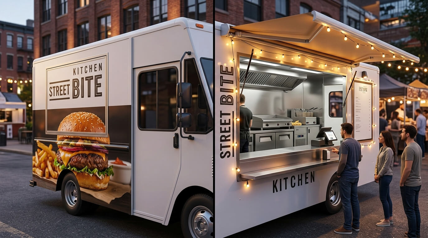
Real Estate and Property Management Vehicle Graphics
Real estate and property-management fleets may include cars, SUVs, pickups, and maintenance vans.
The design should reflect the role of the vehicle. A sales vehicle may need restrained branding, while a maintenance van can carry a clearer service identity.
Useful Design Directions
- Clean logo placement
- Brokerage or management category
- Property photography used selectively
- Agent information where appropriate
- Separate graphics for sales and maintenance units
- Consistent colors across vehicle types
- Removable magnets for temporarily assigned vehicles
- QR codes for parked open-house vehicles
What to Avoid
- Oversized agent portraits on working vehicles
- Several property photographs
- Long lists of neighborhoods
- Personal contact information mixed with corporate fleet information
- Designs that become outdated when an agent leaves
- Permanent graphics on short-term leased vehicles without a removal plan
Healthcare and Medical Transport Graphics
Healthcare vehicles may include mobile clinics, ambulettes, non-emergency transport vans, home-care vehicles, and medical delivery fleets.
The design should feel clear, calm, and trustworthy.
Useful Design Directions
- High-contrast company identification
- Clear description of the transport or care service
- Accessible contact information
- Multilingual information where useful
- Controlled healthcare color palette
- Consistent vehicle numbering
- Visibility around doors, lifts, and accessibility equipment
- Reflective safety elements where appropriate
What to Avoid
- Designs resembling ambulances when the vehicle is not an emergency vehicle
- Small accessibility information
- Important text placed behind lifts
- Unsupported medical claims
- Too many healthcare symbols
- Graphic patient imagery
Accessibility equipment and operating doors should be photographed in open and closed positions before design approval.
Nonprofit and Community Outreach Vehicles
Nonprofits may use vans, buses, trailers, and mobile service units for food distribution, healthcare, education, fundraising, and outreach.
The design should explain the mission without trying to include the organization’s entire history.
Useful Design Directions
- Clear mission statement
- Strong organization name
- Human-centered photography used with permission
- Sponsor recognition in a controlled area
- Donation or volunteer URL
- Flexible sections for campaign updates
- Consistent treatment across mobile programs
- Multilingual messaging where appropriate
What to Avoid
- Too many sponsor logos
- Long paragraphs
- Small donation instructions
- Sensitive beneficiary imagery
- Permanent campaign dates
- QR codes without an alternative response method
A replaceable sponsor or campaign panel can prevent the main wrap from becoming outdated.
Schools, Training Programs, and Childcare Fleets
Educational organizations may operate buses, vans, shuttles, and passenger vehicles.
The design should feel approachable while retaining clarity and appropriate safety visibility.
Useful Design Directions
- Clear school or program name
- Recognizable brand colors
- Simple age-appropriate graphic elements
- Website or enrollment information
- Vehicle numbering
- Controlled sponsor or partner placement
- Door and emergency-exit awareness
- Consistent bus and van branding
What to Avoid
- Excessively childish design for programs serving several age groups
- Small enrollment messages
- Graphics interfering with required safety markings
- Student imagery without authorization
- Contact details placed near moving doors
- Designs easily confused with official school-bus markings where they do not apply
Automotive and Mobile Service Wraps
Detailers, mobile mechanics, glass installers, tire services, towing companies, and roadside-service providers depend on vehicles to deliver their work.
Useful Design Directions
- Clear specialty
- Strong vehicle-service imagery
- High-contrast phone number
- Mobile-service wording
- Service-area information
- After-hours visibility
- Graphics positioned around tool compartments
- Separate design tiers for service vans and tow trucks
What to Avoid
- Generic sports cars unrelated to the customer’s work
- Too many automotive brand logos
- Small lists of repairs
- Designs resembling law-enforcement vehicles
- Critical text on moving or high-wear equipment
- Unsupported claims about response time
One Brand Can Support Several Industry Divisions
Some companies serve more than one market.
A contractor may operate plumbing, electrical, and HVAC divisions. A property-services company may provide cleaning, restoration, and maintenance. A logistics business may operate delivery, warehousing, and moving services.
These divisions can be distinguished through:
- Controlled accent colors
- Department labels
- Different service photography
- Vehicle-type assignments
- Consistent primary logo
- Shared typography
- Shared contact-information treatment
- Unified rear-panel structure
The fleet should not look like several unrelated companies unless the business intentionally operates separate brands.
Design Around the Vehicle’s Daily Work
Industry determines more than the marketing message. It also affects how the vehicle is used.
Before approving a layout, review:
- Which doors remain open
- Where employees handle the vehicle
- What equipment is attached
- Which panels receive abrasion
- Where mud, salt, grease, or chemicals collect
- Whether the vehicle operates at night
- How long it remains parked at customer properties
- Whether graphics must be updated regularly
- Which legal or operational markings must remain visible
A design that ignores the work environment may look good in a mockup and fail during regular service.
Turn Industry Knowledge Into Better Vehicle Graphics
A strong vehicle wrap should help the right customer identify the business quickly.
Pixel Wraps designs, prints, laminates, and installs commercial graphics for:
- HVAC and plumbing fleets
- Electrical contractors
- Construction companies
- Roofers
- Landscaping businesses
- Moving companies
- Delivery and logistics fleets
- Cleaning and restoration services
- Pest control businesses
- Food trucks
- Real estate companies
- Healthcare providers
- Nonprofits
- Schools
- Mobile service businesses
Our team works with trucks, vans, pickups, box trucks, trailers, buses, cars, and specialty vehicles. We adapt the message and design to the vehicle while maintaining consistent branding across the complete fleet.
Pixel Wraps serves businesses throughout New York City, New Jersey, Pennsylvania, and the tri-state area. Send us your vehicle information, brand files, service priorities, and project goals. We will develop a wrap direction based on how your industry operates and how customers encounter your fleet.